

Properties
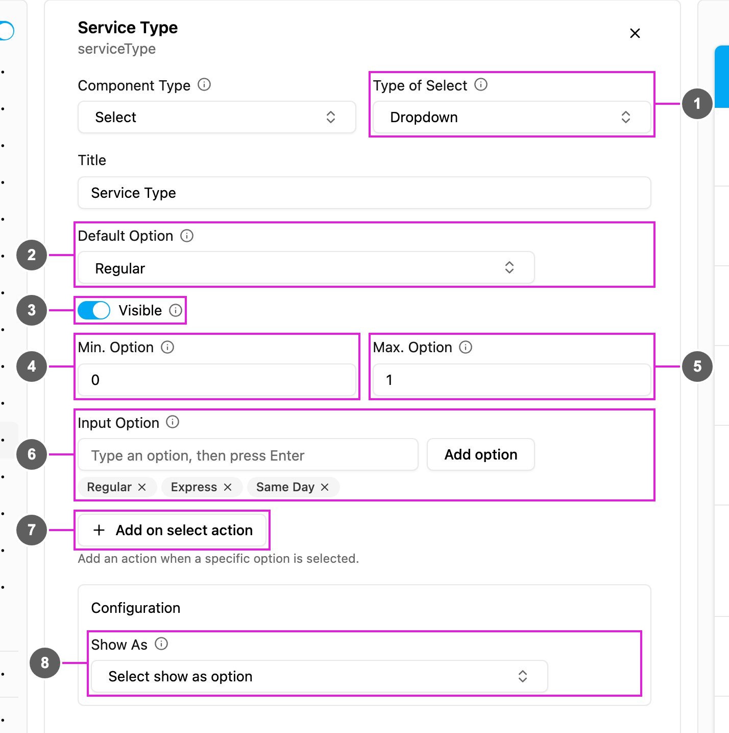
- Type of Select: how the options are shown:
- Dropdown: a list that opens when tapped.
- Checkbox: every option with a box to tick.
- Button: every option as a button.
- Default Option: an option picked in advance for every new task, or No default.
- Visible: when off, the component is hidden on the web and the field app; its value is still kept and exported.
- Min. Option: the fewest options that must be picked. 0 makes the component optional; 1 or more makes it mandatory.
- Max. Option: the most options that can be picked, at least 1. Set it above 1 to allow several answers.
- Input Option: the options. Type an option and press Enter, or click Add option. Click × to remove one. At least one option is needed, and each must be unique.
- Add on select action: add a rule that acts when a given option is picked. See On select actions.
- Show As: show the chosen option in the task list as the task’s Title, Content or Label.
Select has no Required switch: set Min. Option to 1 or more to make an answer mandatory.
On select actions
An on select action changes other components when an option is picked. For example: when Delivery Status is Failed, show the Failure Reason question; when it is Delivered, hide it.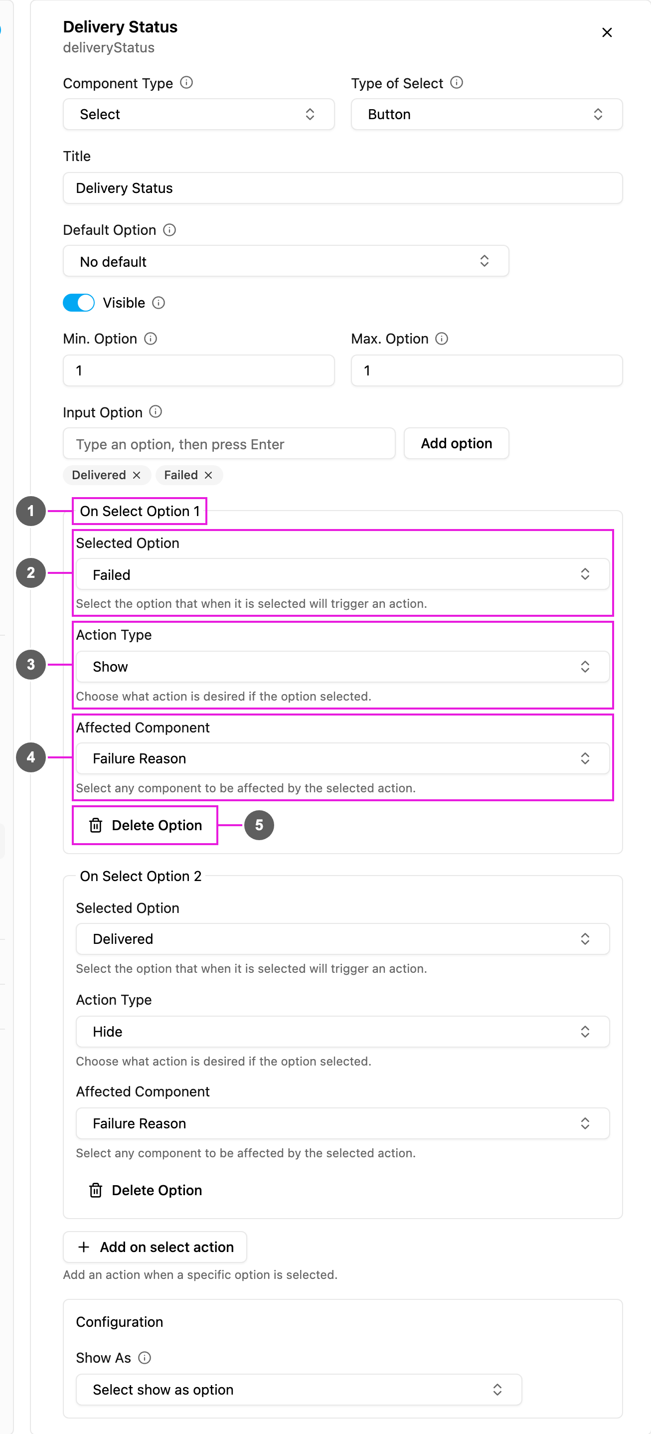
- On Select Option 1: each rule is numbered. Add as many as you need.
- Selected Option: the option, or several options, that trigger the rule.
- Action Type: what happens:
- Show: display the affected components. Their values cannot be changed.
- Hide: hide the affected components, so they cannot be seen or changed.
- Fill: display the affected components and let the user fill them in.
- Affected Component: the components the action applies to. Pick one or more from any page.
- Delete Option: remove this rule.
How to set it up
1
Add the component
Click Add component and choose Select. Pick the Type of Select.
2
Add the options
Type each option in Input Option and press Enter.
3
Set how many can be picked
Set Min. Option and Max. Option. For a single required answer use 1 and 1.
4
Add actions (optional)
Click Add on select action, pick the Selected Option, the Action Type and the Affected Component.
On the field app
The options appear as a dropdown, checkboxes or buttons. Picking an option runs its actions at once, so hidden questions appear or disappear as the user answers. The task cannot be saved or finished with fewer than Min. Option or more than Max. Option answers.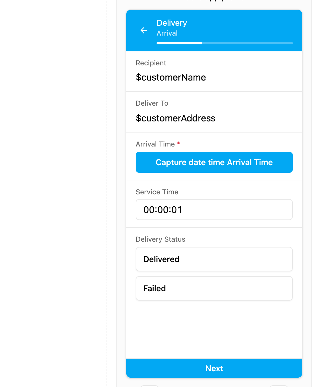
Delivery Status as buttons. Failure Reason stays hidden until Failed is picked.